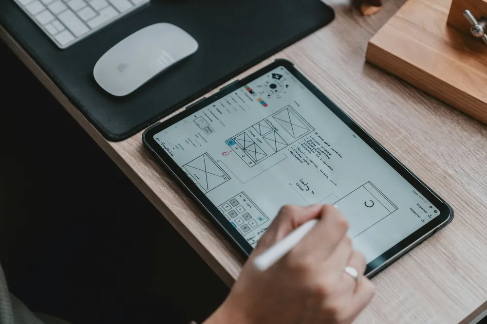
When we discuss design, many people immediately think about aesthetics—the colors of a website, the sleek lines of a product, or the layout of an app interface. While these visual elements are crucial and certainly grab attention, design is far more than what meets the eye. In the world of enterprise solutions, design involves much more than just visuals. It’s about creating experiences that work well and resonate with users.
The Relationship Between UI and UX: More Than Meets the Eye
It’s easy to see UI and UX as separate disciplines: UI as the visuals and UX as the feel. In reality, they are deeply interconnected. A beautiful interface may catch the eye, but it’s the underlying UX that keeps users coming back. For enterprise solutions, where users often have complex tasks, UI design becomes crucial to improve functionality and satisfaction.
Designing for enterprise is not just about adding visual polish; it’s about making decisions that enhance usability. For example, arranging content to prioritize important tasks, using color to guide attention, and ensuring that interactive elements are placed intuitively—all these UI decisions shape the experience.
Why Aesthetics Aren’t Enough
The role of aesthetics in enterprise design shouldn’t be underestimated, but they must serve a purpose beyond looking good. Consider a dashboard filled with data—just making it colorful isn’t enough. Colors need to convey meaning, such as highlighting urgent issues in red or showing positive trends in green. When visual elements are used intentionally, they help users understand complex information at a glance.
In enterprise environments, where users are often under time pressure, UI decisions can make or break productivity. A visually appealing button is nice, but if it’s not placed intuitively, it won't matter how good it looks. It needs to be easy to find and interact with.
Making UI Decisions That Enhance UX
To truly enhance user experience through UI design, consider the following:
- Clarity Over Clutter: Visual simplicity helps users focus on what matters. Clear navigation and logical grouping of elements can transform a cluttered interface into a user-friendly space.
- Visual Hierarchy as a Guide: Design should guide users naturally through tasks. By establishing a visual hierarchy—using size, color, and placement—you can direct users’ attention effectively.
- Feedback and Interactivity Matter: A good UI provides feedback that reassures users. Visual or auditory cues confirm actions, helping users feel in control.
- Consistency Builds Familiarity: Consistent elements across the interface lead to efficient navigation and less frustration.
The Bottom Line: UI as a UX Catalyst
Ultimately, UI design creates an environment where users can work efficiently and comfortably. Thoughtful UI can amplify the user experience, making software not only usable but enjoyable.
When the UI works well, users may not even notice it—and that’s the point. A well-designed UI fades into the background, allowing users to focus on their tasks. When we talk about UI in enterprise solutions, we’re really talking about shaping experiences, not just surfaces.


